This carving served as inspiration for segmenting a pencil into smaller elements.

This carving served as inspiration for segmenting a pencil into smaller elements.
Pencil reference #1 – the hexagonal shape appeals to me and its length offers ample opportunity to segment into different elements to act as a timeline.

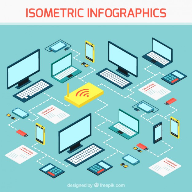
Additional example of isometric vector-based information graphics.
“thinking is drawing” — Alan Fletcher
“the pencil is a kite flown by the mind” — Ross Renwick
Despite exponential technological change and the push into a screen-based, digital space, the pencil has remained ever constant in the designer’s ‘toolbox’ and is a fitting visual metaphor for design education; places of creativity and idea generation.
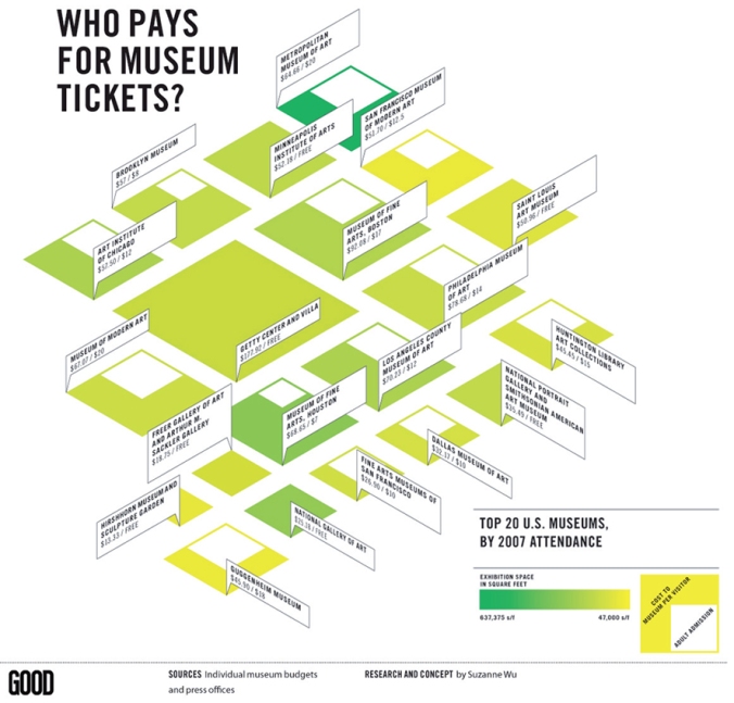
This information graphic by Suzanne Wu for Good Magazine (2008) uses an isometric illustration style. The opposing 30 and 60 degree angles create an interesting visual language. This type of visual representation would be suitable for Assessment 3.

Interesting visualisation of overlapping artistic periods and the corresponding advancements in technology. More at http://gdh.2rsolutions.cz/
1990 – The Digital Revolution
1985 – 2010 Global Dialogue / Social conscience
1975 – 1985 Post-modernism
1960 – 1970 The Conceptual Image
1950 – 1960 Corporate Identity and Visual Systems
1940 – 1955 International Style
1935 – 1950 Modernism
1920 – 1935 Bauhaus
A grouping of design periods. Initially linear, but we can see that from post-modernism onwards change becomes exponential with a blurring of earlier, neatly defined, sequential categories.
1919: Bauhaus opens in 1919. The German design school quickly became the powerhouse of modern design, often employing Art Deco and what would become the Swiss styles.
1920: Art Deco graphic design, with its bold geometrics and high contrast emerges alongside the fine art. It lacks the depth of other styles and is used through the Roaring Twenties and into the 40s.
1940: Negative space and clean designs formulated the Swiss style of design.
1968: Inspired by hallucinations, the Psychedelic style emerges and plays to the counter culture. Swirls, obscure fonts transformed into shapes, and bright colors permeated the often hard-to-read designs.
1970: Illustrations that revolved around collage became popular in the Post-Modern movement. The overlaid elements and impulsive feel was common through the 80s.
1990: The first version of Adobe Photoshop is released, creating a revolution in the way graphic designers work.
2000: Grunge design emerged along with the punk rock scene as more designs used texture to portray a dirty feeling. This style remained popular through the 2010s.
2010: What became known as the Flat style plays off the minimalist feel with sharp lines and surprising twists like the excessive use of negative space.
Source:
Philip B. Meggs, Alston W. Purvis. “Meggs’ History of Graphic Design.” Fourth Edition. John Wiley and Sons, Inc. 2006.
“Since flat design has been around for several years now and is still going strong, it’s likely more than just a passing trend…”
“We challenged ourselves to create a visual language for our users that synthesizes the classic principles of good design with the innovation and possibility of technology and science…”
Google’s comprehensive outline to Material Design and its principles. Considered to be the definite voice on the subject matter. Wired Magazine introduces Material Design here:
https://www.wired.com/insights/2014/12/google-material-design/
The full style guide can be found at the following link:
https://material.io/guidelines/#introduction-principles


