Study 1:
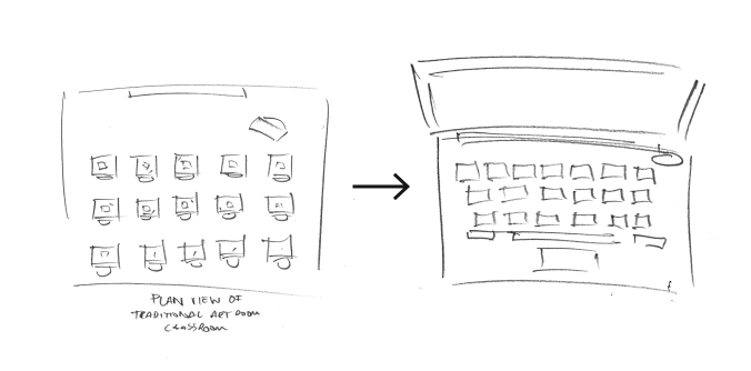
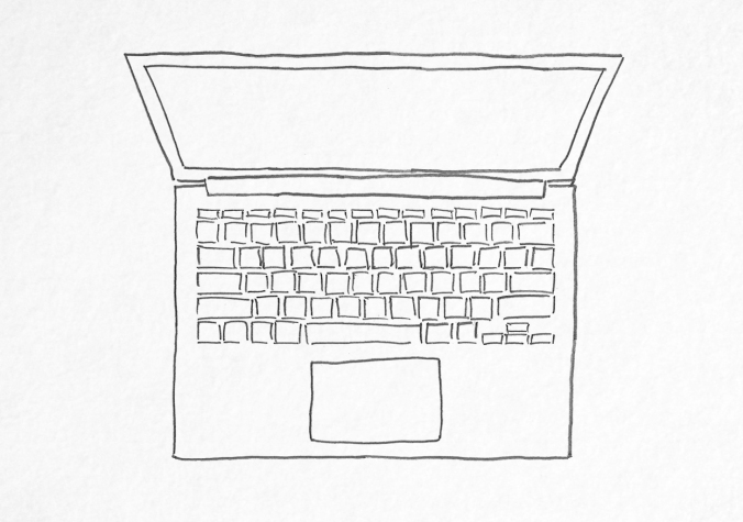
Initial thoughts are to show the transition of a traditional art room / classroom into a laptop, the modern-day equivalent. The arrangement of art desks shown in plan view could be morphed into the keys of a laptop — the similar shapes and their repetition would naturally lend themselves to this.
Study 2:
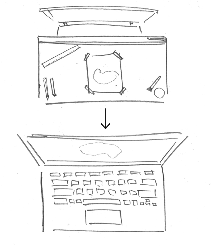
Rather than attempt to represent the transition in a highly detailed level, the alternative option is to reduce complexity and focus on a key graphical similarity – retaining the essence of the idea, but increasing clarity. To this extent, drawing a parallel between the shape of an art room desk and a laptop, instead of all the individual keys, the idea remains but in a more succinct way.
Additional visual similarity can be created through the perspective of the screen and the placement of a traditional, artist stool with back.
Style thoughts:
The original intention was to recreate all artwork in vector format for ease of editing. However, a rougher, hand-drawn pencil scan is more authentic and connected to the metaphor used in Assessment 3. A vector-based style felt too clinical in comparison.
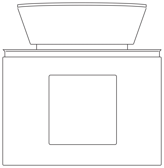
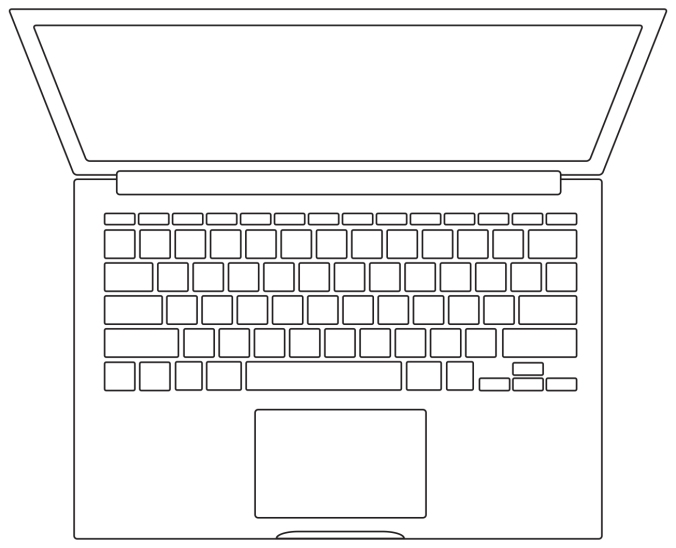
A vector-based style felt too clinical
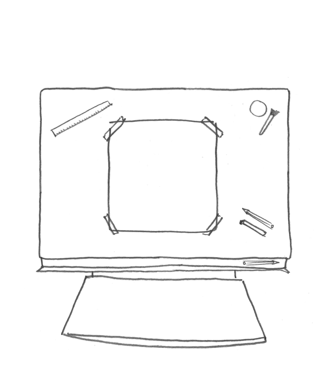
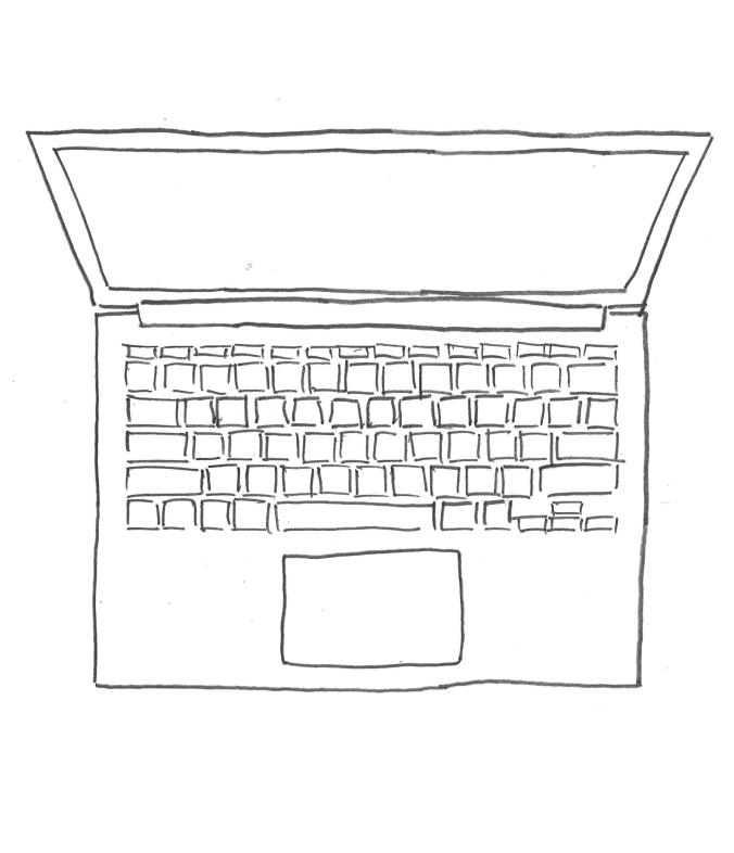
A hand-drawn style was more authentic and visually interesting
Final treatment:
The final style treatment has been achieved by using the hand drawn aesthetic and overlaying it on a subtle paper texture, giving added depth and helping fill out a screen-based, 1080p frame without it appearing empty.
Moving image / animation sequence:
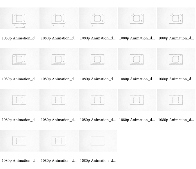
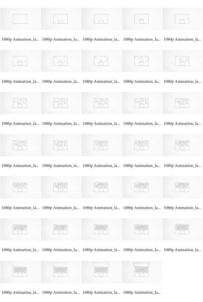
A stop motion sequence that ‘draws in’ each line / item would create an interesting transition. I see this working as per the frames below. The shape of the desk and the shape of the laptop are consistent in their orientation, establishing a perfect cross-over point.
